Faceted navigation is an elegant and popular solution to finding a needle in a haystack. Start with a keyword . . . Present a list of results with a range of facets (categories) and how many of the results fall into that category . . . user can choose to refine the list by the facets, getting them closer to the result that they really want.
Great. And it often works really well:
Here's Ocado's shopping interface, very helpful and I don't really care (because I'm shopping on Ocado, so I've got pots of money) if I've seen all the options, just that I've got the right kind of thing. Only the 'more' link is pretty weak - I might not think to find the 13 other brands behind that link - good news for the first 4 in the list but potential disaster for anyone at the bottom - so how do they choose who goes first?
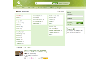
But Ocado is dealing with a small dataset that they can control. And their facets are in a pretty narrow range. What would happens when we need to search through thousands and thousands of possible items?
The facet list gets incredibly hard to use if it has many different types (category, temporal, numeric, geographical, etc.) and they are all jammed into the same interface. And list ordering of the facets can get a little crazy if the same rules are applied to each type.
Here's how ebay deals with it:

Categories are given priority, and presented as a list of links ordered by count - very sensible. Users can then pick all sorts of other ways to filter the results, from entering a price range into a form to picking the condition (new, used etc.) from with checkboxes. Each type of facet selector and display is designed according to its type and the perception of its use. To create space on the interface, other refinement options are collapsed into easily interpreted header bars that can be 'opened' by clicking on them. A > indicates there is something to expand.
So far, so good. I've found a chair in my price range and near enough to my house that will fit into my daughter's dolls house. But did I find the best one? Did anything get lost because I bypassed its category?
Faceted navigation is very good at getting users closer to better fit results, but it is also very good at losing results. Because selecting one facet tends to exclude the others, items that are in a category that users didn't think to select, didn't notice or was misapplied will be hidden. Think about your local telephone listings. If you're looking for a plumber, then you will look under 'P' and find the plumber section. Great. If you are a plumber and you accidentally get put into the 'runners' entry because you had a cold on the day you called the publishers, you will never get any inquiries. If you are are a plumber but head office's marketing department insisted on listing you under 'Water and Sewerage Service Providers' then you stand no chance.
It happens. The more we rely on faceted searching and browsing, the more we need to validate the relationships between the terms we use to categorise, and the terms used to discover. Search algorithms help, but add complexity. But the bottom line is that the tags (metadata) applied to items needs to be of high quality and consistent and the interface needs to be supported by semantic rings and thesaurii that can help users explore related categories that might also hold what they seek.
I don't have a picture of anyone doing this properly, but some of the alternative search engines go a long way to provide best bets and category hints. And go look in the yellow pages under any category and you'll notice a 'See Also' list of related categories.
So on to the issue that I struggle with most, and the one that I'm hoping to explore other's opinions on. Facet selection.
We've tackled the interface, we've got bespoke display and selection methods for different facet types, we're carefully ranking facet results and we're providing visibility into hidden facets. Now it's up to the user to narrow away, selecting facets that match their criteria and surveying the results returned.
And now I get stuck. Let's consider the scenarios.
1 - One at a time.
For each facet a user selects, the entire search is executed again and the facets recalculated, updating the display.
Good? Well, it is perhaps the best way to inform the user of the effect their choice has made on the other available facets, and prevent them from persuing invalid combinations.
Bad? For a big dataset a user can wait a long time for those new results so is it really better than just clicking through pages of results, and losing a facet that you had before can be confusing if that was the one you really want to include.
2 - One from each group.
Ok, so you might have a list of colours and a list of locations. Do you let users choose more than one colour? From a search engine perspective - no. Choosing a facet is narrowing into a bucket of results not two buckets, facets ought to be binary switches and you undo one to add another or the counts get all screwy. But what about the user? What if they don't mind yellow or blue, but they don't want green. And they might have a few locations that they can cover, but not all of them. Forcing them to dip in and out of facet results is not an effective way to deliver the range of results they are looking for and the facets quickly become an obstacle, not a tool.
3 - Lots of facets, one at a time.
This is a classic response to the issues above. You can select more than one facet, but the results are still repopulated after each. Sounds ideal, except that now the user has to choose the facets in the right order, or experiement with switching facets on and off, particularly if there is more than one type of facet. Consider this - I'm looking for information on arms production in the UK that covers the period since the 1950's or before 1930 (I don't want to know about the World War periods). A search for 'arms production UK' gives me facet selection options, and the interface puts the format choices at the top. So I choose - I switch on eBooks, journals, websites, as these are the easiest for me to look at quickly. The periods I can choose from are missing several options now, but I choose the ones that apply, and finally, the results I get list 54 items. OK, but by choosing my publication types first I missed several decades of results that I might have got value from, just because they were in the category 'books' that I chose not to select. If I had chosen the dates first, I would have seen that most of the results for the dates I wanted came from that category.
4 - Lots of facets, all at once.
So this is best, right? Well, not necessarily. Choosing all the categories that apply to my needs and then executing is really only suggesting keywords, and I still have to guess which result is in which category. We're not really 'browsing' by facets at all and the counts can't contribute to choices.
So where now?
There are 4 big issues that stand out for me:
- Category lists create a new market for real estate at the top of the list
- Ordering category lists needs to consider the type of facet being displayed and how it well be used
- Category labels need to match users expectations
- The method of selecting facets can have a significant effect on the results
Some of the issues discussed here can be solved with enough budget or improvements in technology. One thing seems certain though, faceted navigation is increasing and, as it permeates into the commercial and information retrieval environments online, there will be new challenges and priorities for information and product providers who rely on being found.


 Posts
Posts

